SCdesign
Expertise
UI and visual design
Platform migration
Web development
Deliverables
Sitemap & wireframes
Responsive website

BACKGROUND
Designer portfolio needs a refresh
The portfolio website of an experienced Product Designer based in Chicago, which was originally created using Wix years ago, was due for a refresh.
As part of the update, it was communicated that the refresh needed to steer the design direction towards minimalism with an emphasis on clean & user-friendly interface for quick navigation, inclusion of SEO optimizations, Open-graph and custom Form integration for receiving messages from site visitors.
OPPORTUNITY
Easy to digest, minimal portfolio
While designers can, sometimes, get carried away with their portfolio trying to showcase & implement different design aspects, it was important to structure a cohesive presence for this minimal themed portfolio while showcasing different projects.
Emphasis on keeping it clear & concise, easy to read & digest the info. was a top priority for Sonam as she understood her target audience, and wanted the updated portfolio to make it easier for recruiters & hiring managers to preview her work quickly.
DELIVERABLES
Portfolio that reflects authority
As part of project deliverables, one of the overarching principle was to ensure the portfolio projected an aura of experience and subject authority through calm & cohesive design.
The portfolio website needed to convey the essence of a certain level of work experience through its use of minimalism of modern design, understated typography and high-impact visuals.
Essential items checklist
✔️ Seamless platform migration
✔️ Website sitemap
✔️ Wireframes & concepts
✔️ Minimal & modern aesthetics
✔️ Designed for info. consumption
✔️ Responsive & performant design
✔️ Projects with CMS integration
✔️ SEO optimized content
INITIAL CONCEPT
Sitemap & Wireframes
To begin with, sitemap & wireframes gave us the freedom to explore site structure and confirm the overall information mapping prior to designing. It also helped underscore the overall project scope and highlight CMS integration for various work items.
By creating & discussing wireframes at mid-fidelity level, it made it easier to visualize ideas and build trust in order to deliver a website that would embody the spirit of the simplicity of the final design.
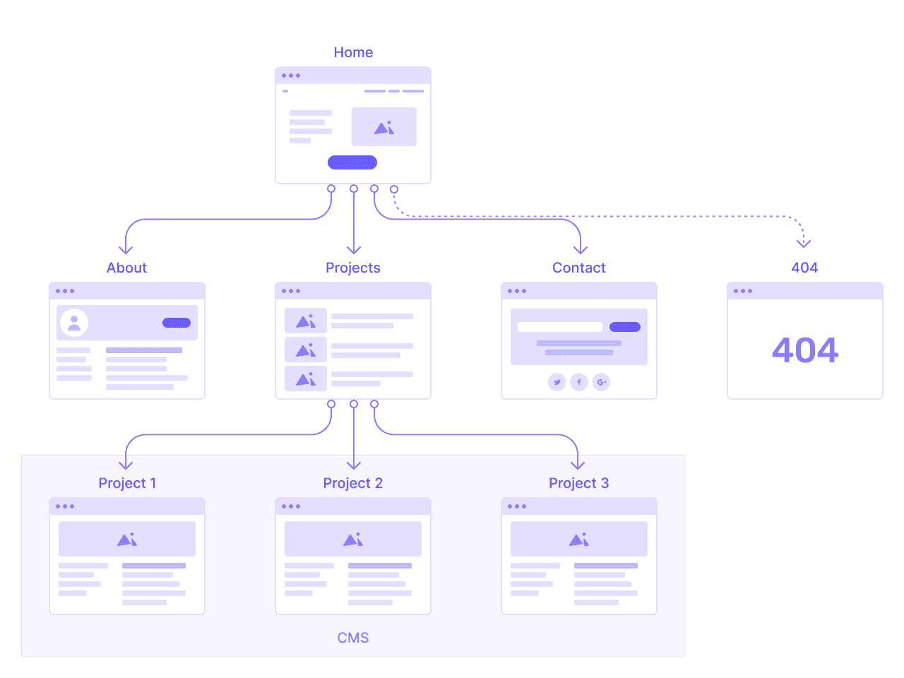
SCdesign - Sitemap

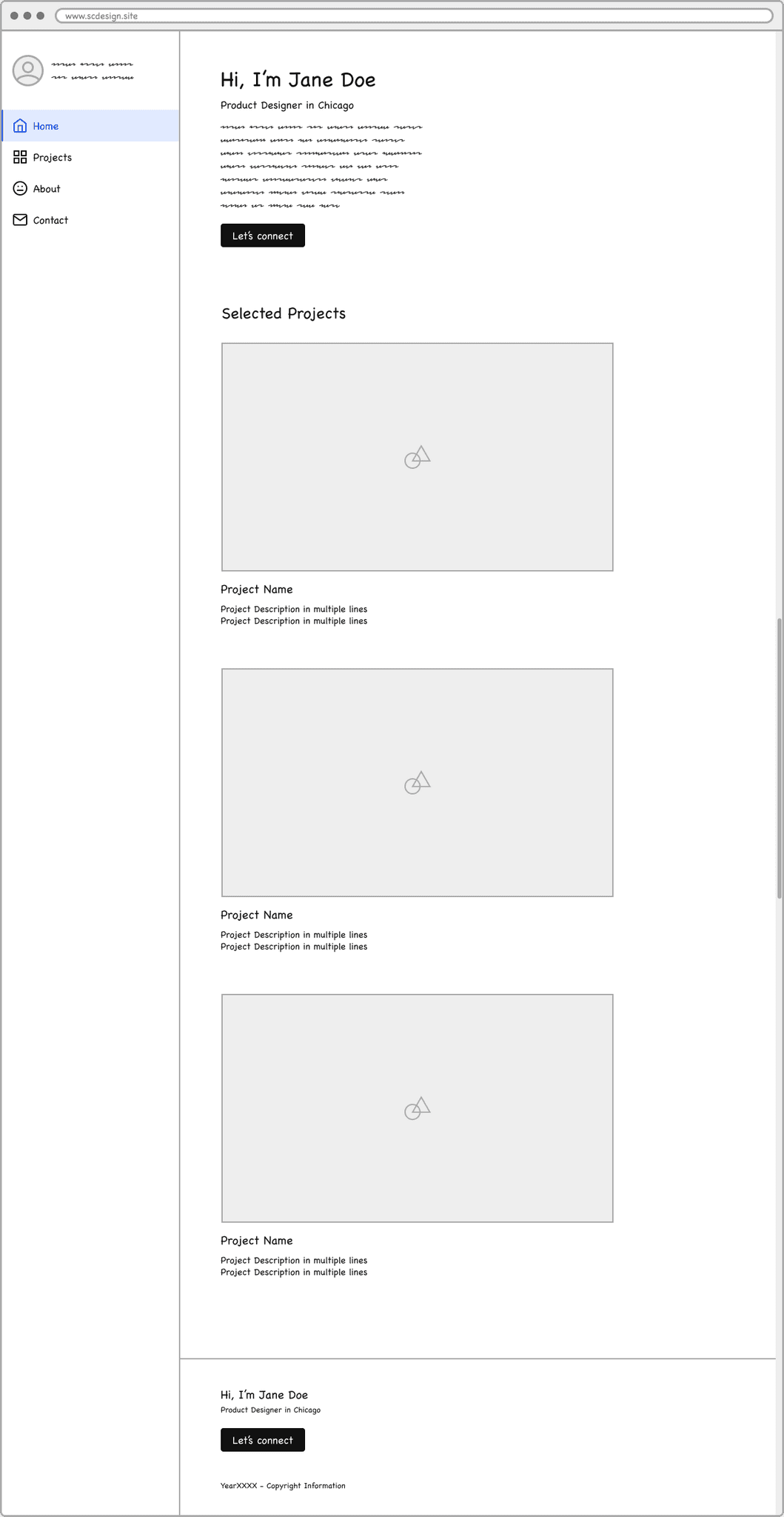
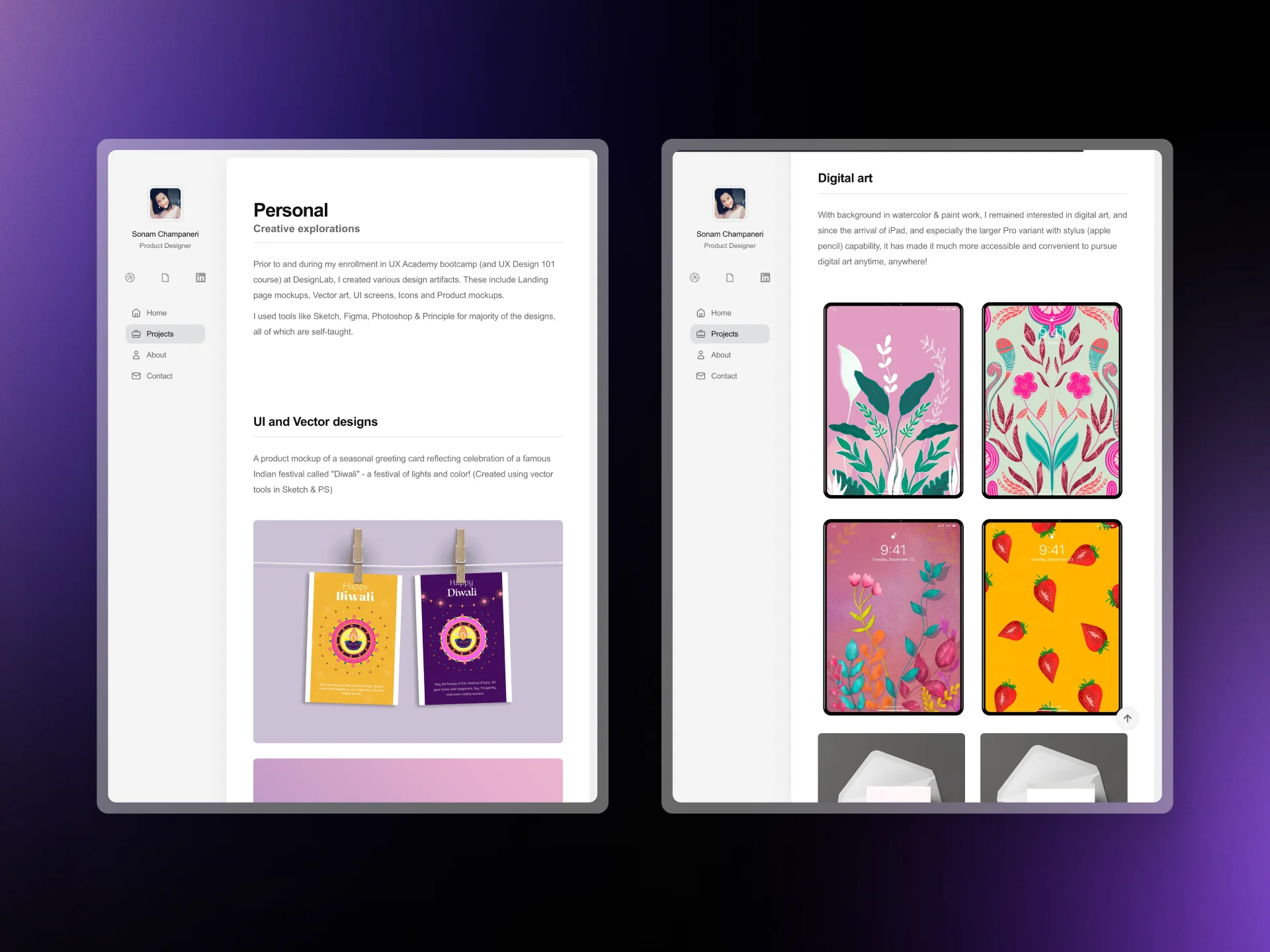
SCdesign - Home page

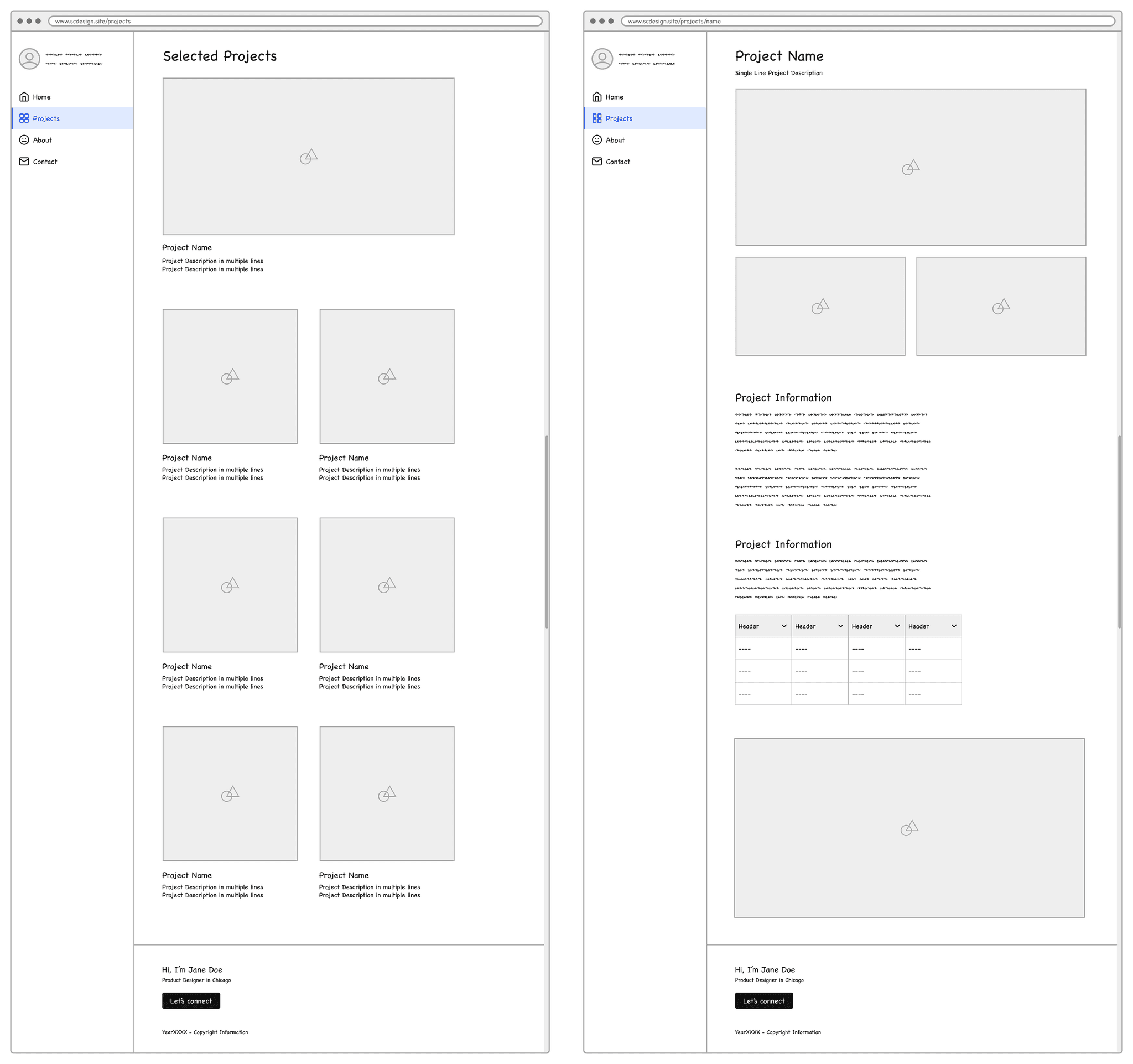
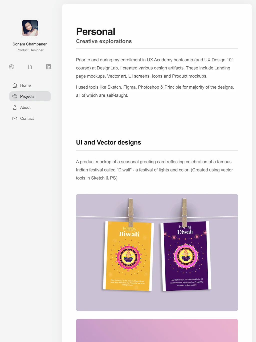
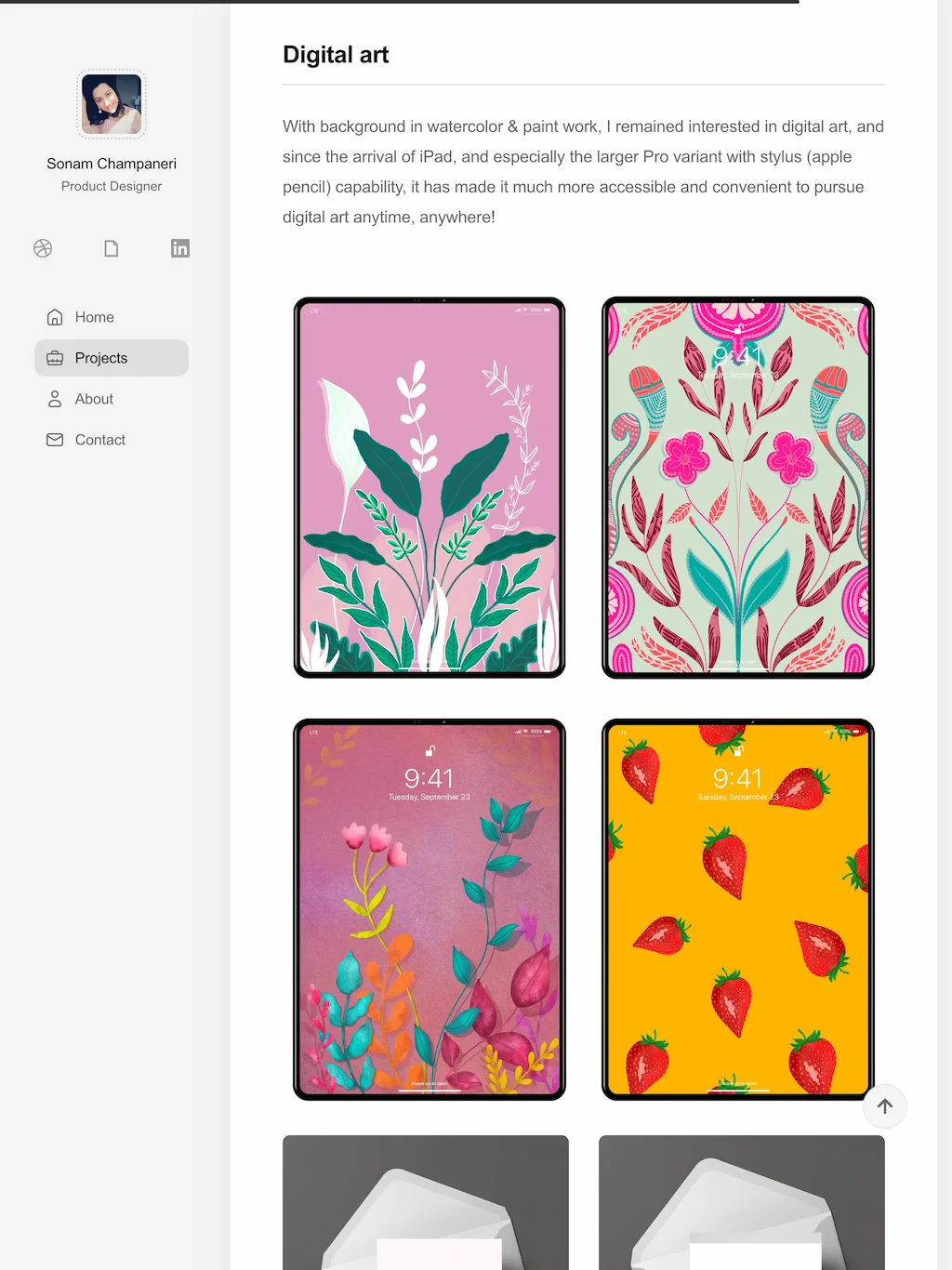
SCdesign - Projects and Project Details page

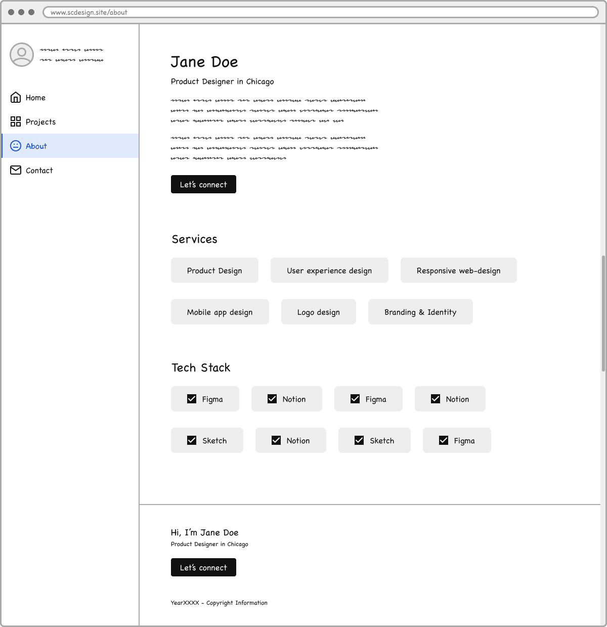
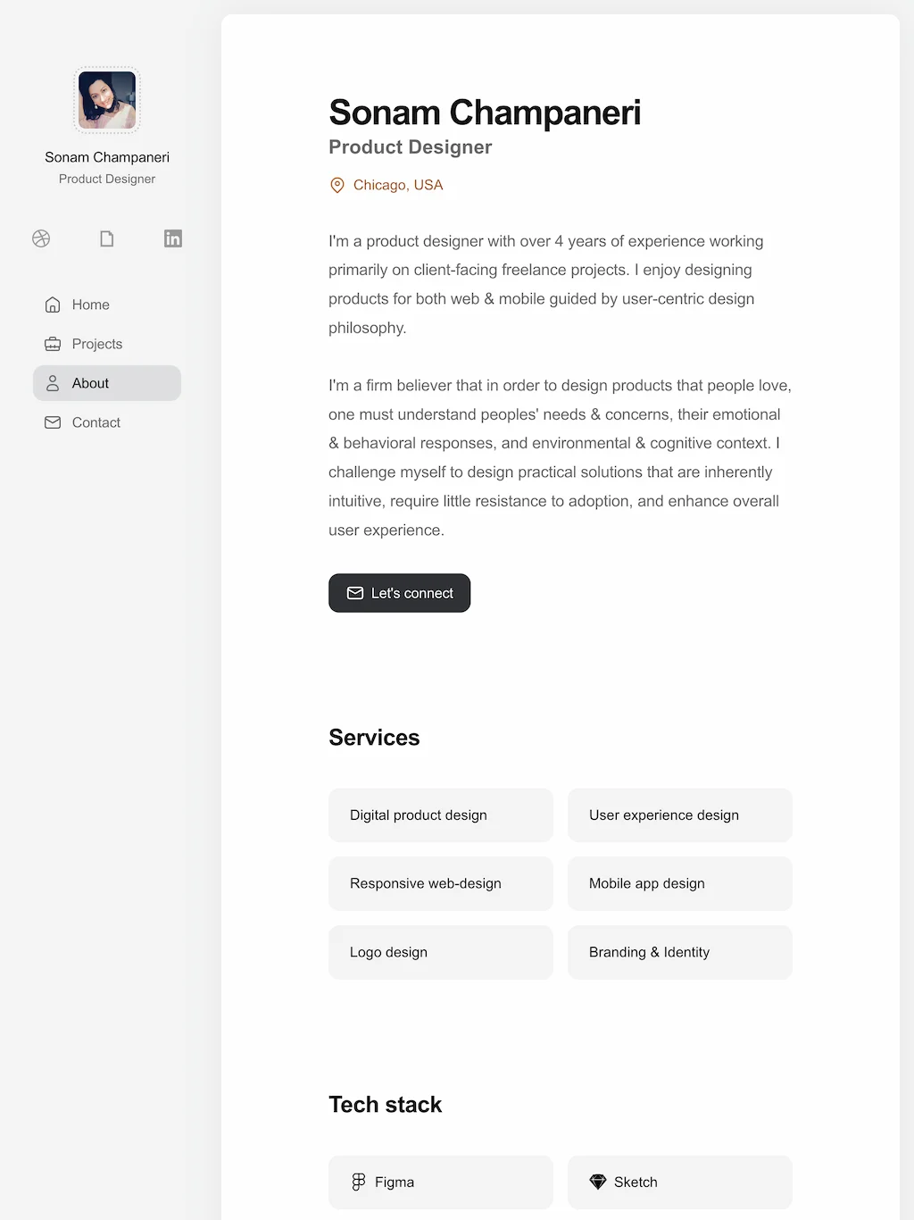
SCdesign - About page

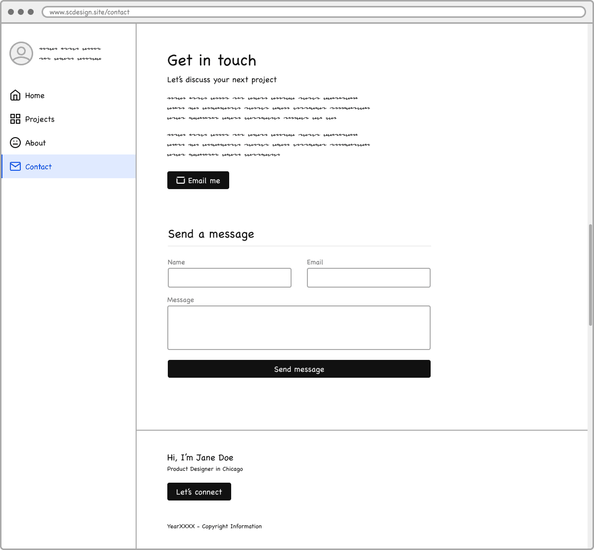
SCdesign - Contact page
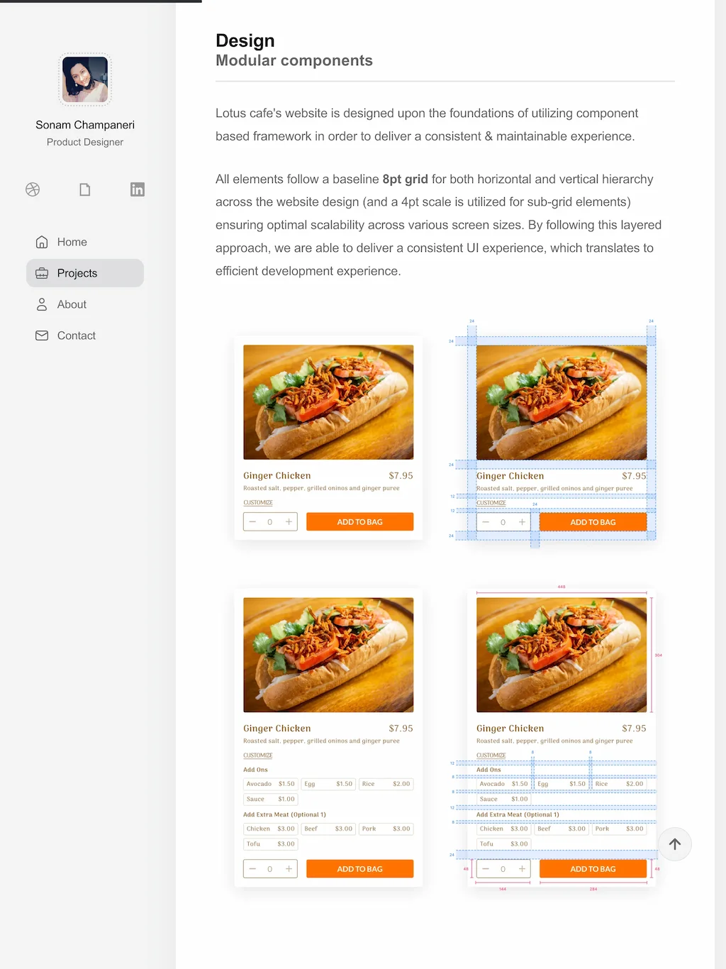
DESIGN
Hi-fidelity screens
After finalizing the sitemap & wireframes, hi-fidelity screens were created to reflect how layout, content, various media assets come together in the final design that evokes a sense of cohesiveness in a multi-project portfolio.
Prioritizing the ability to quickly glance at, or read/absorb the content, remained as pole star for this design exercise. Clean design with high quality visuals brought the portfolio together.
Home page mockup
Home/Projects overview
Projects overview & Footer
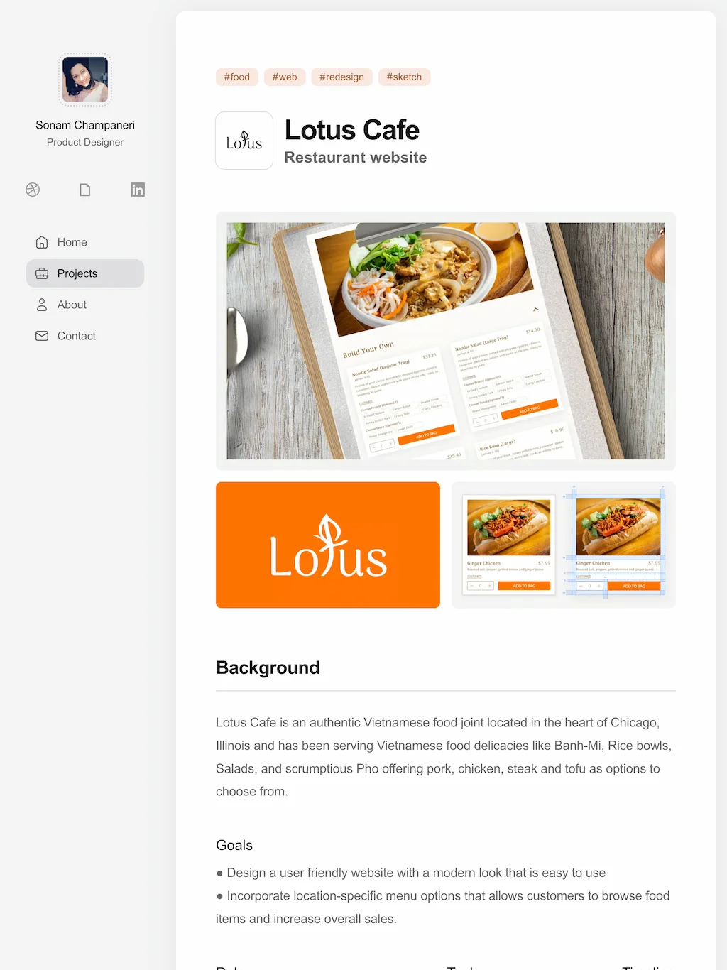
Lotus - Project details
Lotus - Project details
About page
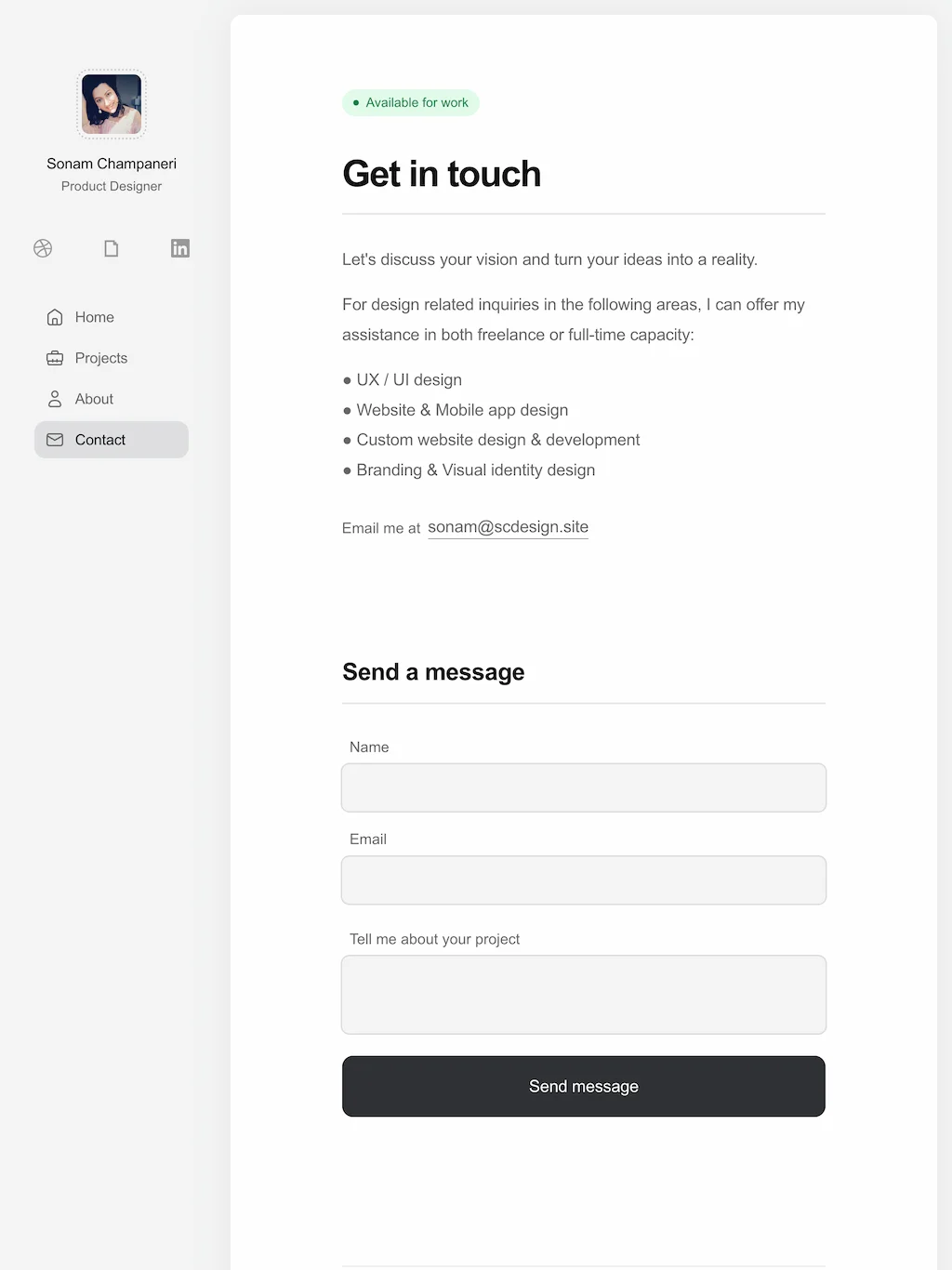
Contact page
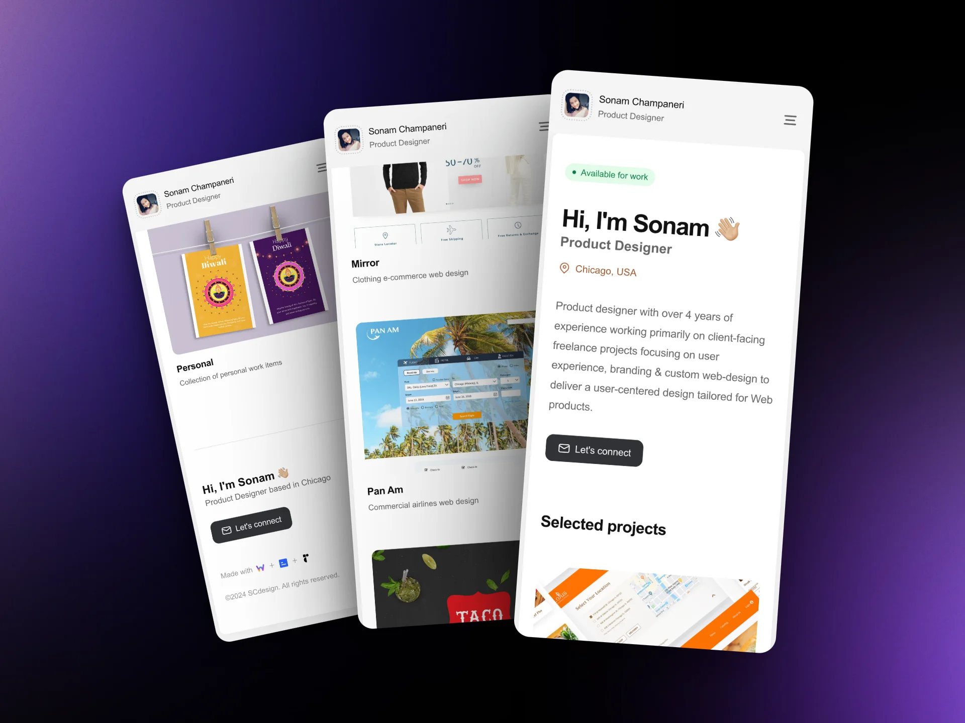
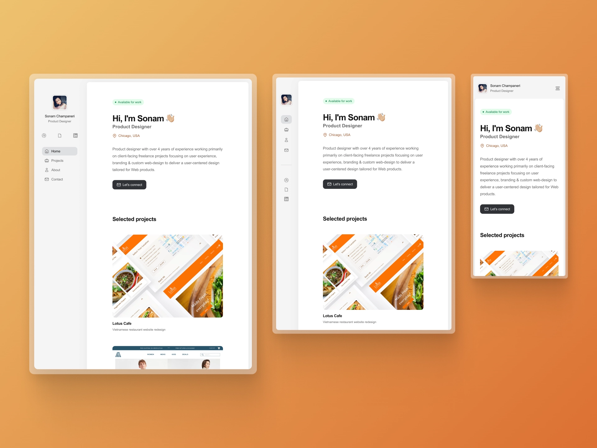
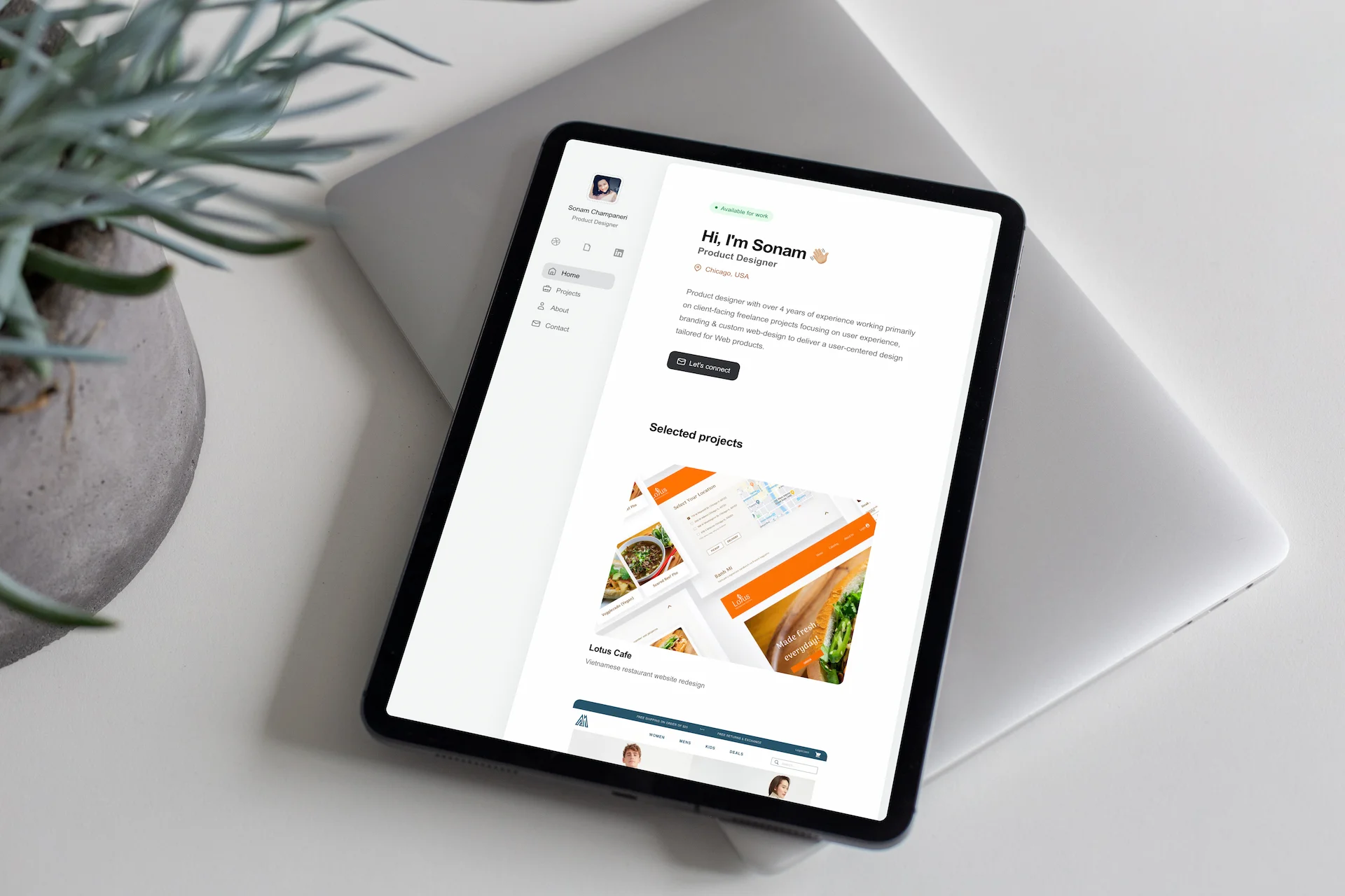
Mobile view of Home page
WEBSITE BUILD
Responsive design that's highly performant
The portfolio website required a platform migration from Wix to begin with. I chose Webstudio as a platform of choice for site migration, development & deployment for its ability to deploy to multiple edge nodes delivering super fast sites, tech-stack reliability and maintainability for future updates.
The website was designed & developed with performance and responsiveness in mind. High quality media assets were optimized to load without any hiccups. All pages and accompanying content was optimized for SEO, and subtle yet engaging animations were added to make browsing more enjoyable.
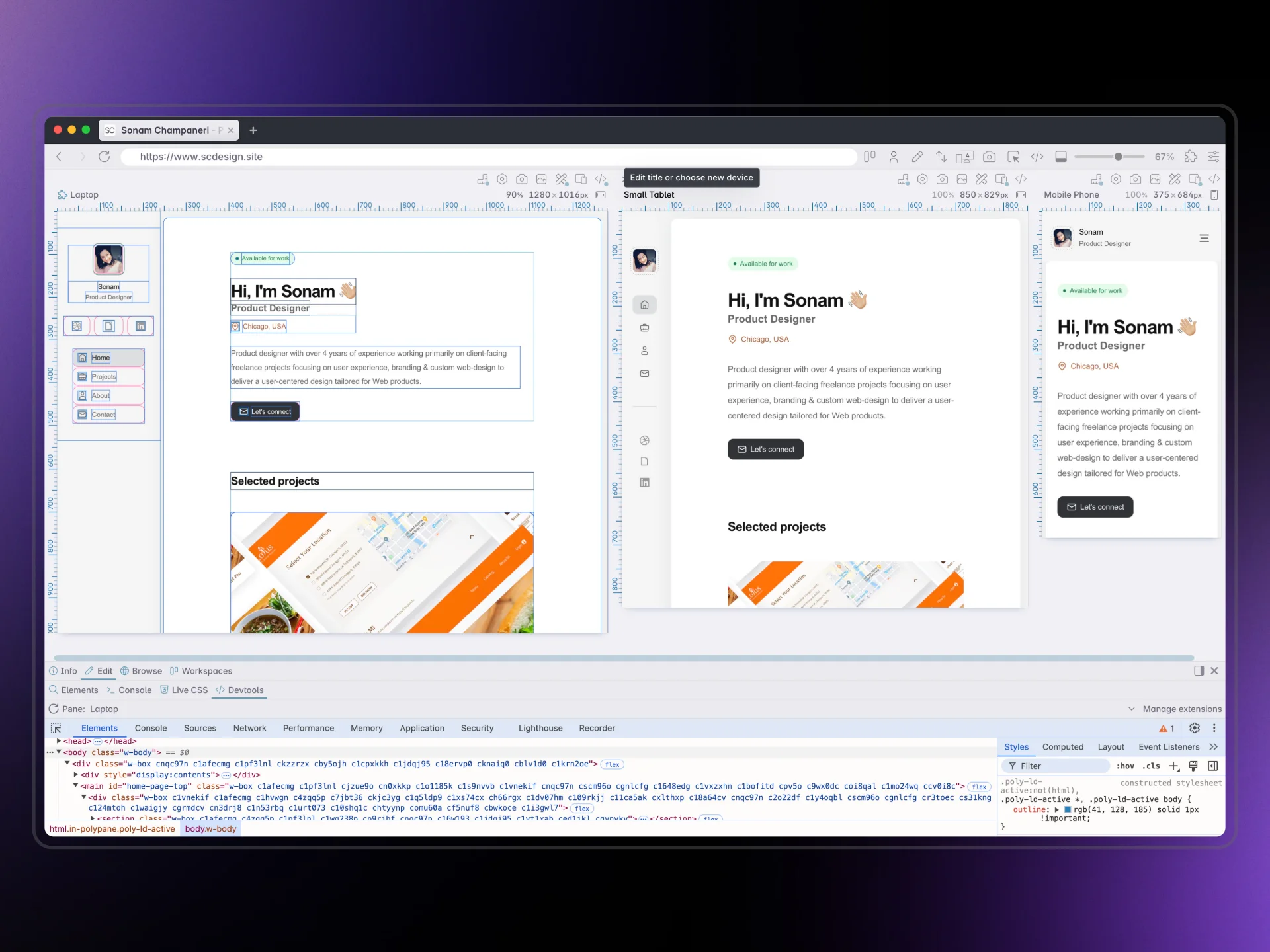
Responsive design - Desktop, Tablet & Mobile
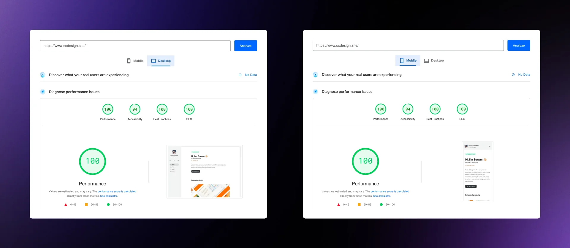
Performance scores via Google Lighthouse for Desktop & Mobile views
OUTCOMES
Project outcomes
Deliverables:
SCdesign portfolio was designed & developed to showcase a product designers' experience and breadth of skillset through a curated set of work, all cohesively fitting together in a minimal fashion to ultimately connect with recruiters & hiring managers easily for design related roles in the future.
Values:
SCdesign website now has roughly 60% smaller footprint, and loads 2x faster on all screen sizes, thanks to being highly responsive and performant across the board. The fixed sidebar menu acts like an app-based navigation making it easier to browse the site. These features combined together result in delivering an optimized experience for the visitor.
In addition, an integrated contact form has enabled recruiters & potential opportunities to connect easily and correspond further resulting in acquiring web-design projects on a freelance basis.